
Dehy
Brand Identity Expansion
Photography, Art direction, Brand Language, Video Production
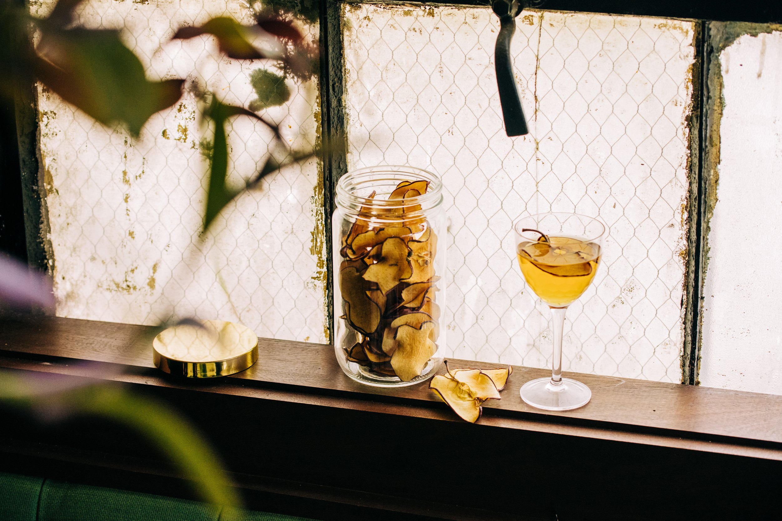
DEHY crafts premium dried fruit garnishes for cocktails, supplying bars, restaurants, hotels, and retail. Their logo and core mark were originally created by local agency Ptarmak, but DEHY came to White Light Exposure ready to grow.
We expanded their identity into a full system—developing brand language, story, and taglines; an extended color palette; typography rules; and a catalog of brand images. With video production and photography, we built the content foundation that let DEHY show up consistently online and in hand.
Brand Story
It all began at a bar, as most good stories do. A bartender noticed the mounds of sliced fruit being thrown out daily and the few that made it to a cocktail were sub par — the sight of a lifeless orange slouched over a drink’s rim all too familiar. DEHY wasn’t written in the stars but it was scribbled on a napkin and to mixologists and cocktail connoisseurs, well, that’s pretty much the same thing. At DEHY, we don’t just make artful, dehydrated garnishes to decorate your refreshments. We make the experience of a great cocktail attainable, sustainable and downright good-looking because we — the bartender, the drinker and said orange — deserve better from and for our spirits. We aren’t pretentious and we don’t think a good — no, great — cocktail has to be either. We simply uphold the virtue of a cocktail for gathering’s sake.
Part of DEHY Garnishes’ Instructional Cocktail series, produced by White Light Exposure, featuring locally-loved bartenders, and the various uses of the dehydrated garnishes.


Photography: Letitia Smith
Brand Language, Art Direction: Chelsey Korman
Logo: Ptarmak